Occasionally we need to use custom html to obtain the layouts shown on our demos in specific modules. The code below is what was used on this template:
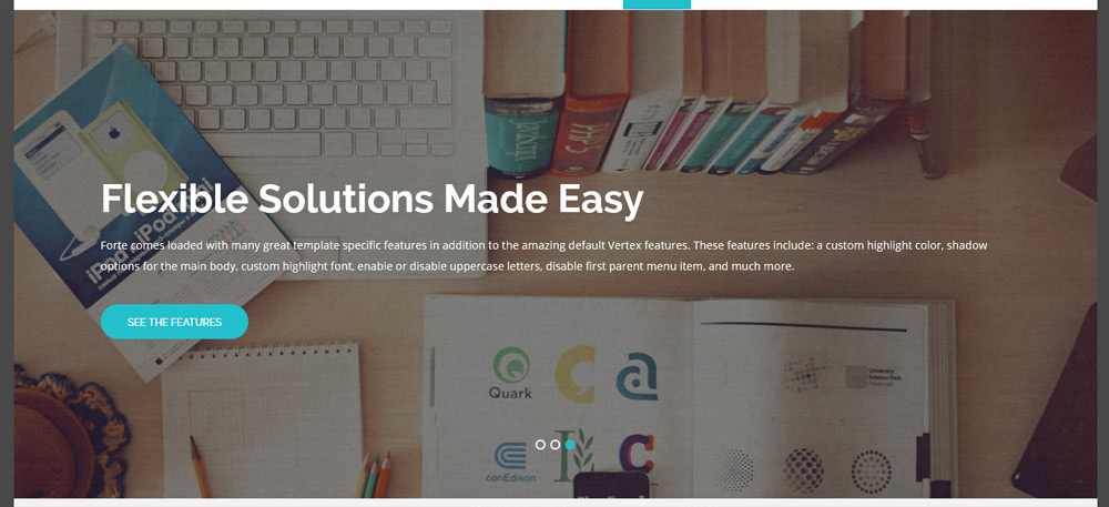
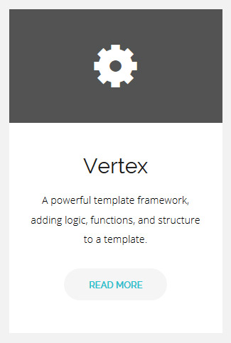

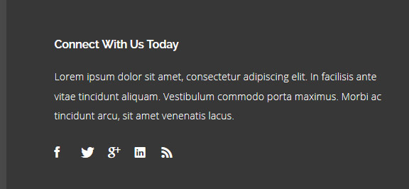
Image and Content Fader Code:
This is for the code that we used for each slide in the S5 Image and Content Fader module. Titles are entered in the specified module fields.
The Shape5 Vertex Framework is a set of functionality that creates the core
logic and structure of a template, and is one of the most flexible, robust and
powerful template frameworks available! With an easy to use backend, dozens of
positions, endless options, and easy to understand workflow you can build
anything on the Vertex framework
<br />
<a class="readon" target="_blank" href="http://www.shape5.com/joomla/framework/vertex_framework.html">Learn More</a>
<br />
<a class="readon" target="_blank" href="http://www.shape5.com/joomla/framework/vertex_framework.html">Learn More</a>
Icon Boxes:
These can be published to any position as a custom html module with no module class applied. Ion Icons must be enabled in the template configuration.
<div style="background:#525353" class="icon_wrap">
<i class="ion-gear-b"></i>
</div>
<div class="icon_text">
<h3>Vertex</h3>
A powerful template framework, adding logic, functions, and structure to a template.
<br />
<a href="index.php/features-mainmenu-47/template-specific-features" class="readon readon_grey">Read More</a>
</div>
<i class="ion-gear-b"></i>
</div>
<div class="icon_text">
<h3>Vertex</h3>
A powerful template framework, adding logic, functions, and structure to a template.
<br />
<a href="index.php/features-mainmenu-47/template-specific-features" class="readon readon_grey">Read More</a>
</div>
Join Button:
This should be published to the custom_2 position as a custom html module with no module class applied.
<div class="centered_text">
Join For Free To Download This Template
<br style="display:none" class="line_break">
<a class="readon readon_black" target="_blank" href="http://www.shape5.com/join-now.html">Download Now</a>
</div>
Join For Free To Download This Template
<br style="display:none" class="line_break">
<a class="readon readon_black" target="_blank" href="http://www.shape5.com/join-now.html">Download Now</a>
</div>
Social Icons:
This should be published to any bottom_row3 position as a custom html module with no module class applied. Ion Icons must be enabled in the template configuration.
Lorem ipsum dolor sit amet, consectetur adipiscing elit. In facilisis ante
vitae tincidunt aliquam. Vestibulum commodo porta maximus. Morbi ac tincidunt
arcu, sit amet venenatis lacus.
<br><br>
<a href="http://www.facebook.com/shape5.templates" target="_blank" class="social_icon ion-social-facebook"></a>
<a href="javascript:;" class="social_icon ion-social-twitter"></a>
<a href="javascript:;" class="social_icon ion-social-googleplus"></a>
<a href="javascript:;" class="social_icon ion-social-linkedin"></a>
<a href="javascript:;" class="social_icon ion-social-rss"></a>
Ion Icons is an iconic font that gives you scalable vector icons that can be customized by any font css command, such as size, color, backgrounds, hover effects and more. Below you will see several examples of this feature in action, but please visit http://ionicons.com/ for a full list of all icons available.
Round icon example:
<div class="icon_outer_wrap">
<div class="icon_hover">
<a href="" class="ion-link icon_element"></a>
</div>
<div class="icon_non_hover">
<span class="ion-headphone icon_element"></span>
</div>
</div>
<div class="icon_hover">
<a href="" class="ion-link icon_element"></a>
</div>
<div class="icon_non_hover">
<span class="ion-headphone icon_element"></span>
</div>
</div>
Icon Examples:
<span class="ion-camera" style="display:
inline-block;font-size:2.5em;"></span>
Our Scroll Reveal feature is powered by the script found here: https://github.com/julianlloyd/scrollReveal.js. The script allows you to add "data-scroll-reveal" to HTML elements for on page scroll animations. We recommend adding to DIVs over SPAN etc as DIVs can move vs SPAN tags just fading in. Once you add the code to a DIV refresh a page or scroll down and it will animate in. It will only do this once until you refresh the page again. The great feature about the script is you can use plain English to describe how you'd like to animate your HTML element.
Example of this in action (refresh this page if you didn't see it already):
Enter from the left and move up 50px in 1.33 seconds.
Enter from the bottom after 1 second.
Wait 2.5 seconds and then ease-in-out 100px.
Code used for the above:
<div data-scroll-reveal="enter left and move 50px over 1.33s"> Enter from the left and move up 50px in 1.33 seconds. </div>
<div data-scroll-reveal="enter from the bottom after 1s"> Enter from the bottom after 1 second. </div>
<div data-scroll-reveal="wait 2.5s and then ease-in-out 100px"> Wait 2.5 seconds and then ease-in-out 100px. </div>
<div data-scroll-reveal="enter from the bottom after 1s"> Enter from the bottom after 1 second. </div>
<div data-scroll-reveal="wait 2.5s and then ease-in-out 100px"> Wait 2.5 seconds and then ease-in-out 100px. </div>
Usage:
For a lengthier explanation on this visit the following page: https://github.com/julianlloyd/scrollReveal.js
The Map it with Google module is displayed on this page. Simply enter your address and the module uses the Google API to display a map with a marker to the address. A user simply clicks the marker and they are prompted with a popup box to get directions. Clicking "Get Directions" will take you to google maps with your business address already entered so all they have to do is enter their address to get directions. You can also specify the size of the map and whether or not to enable or disable certain controls.
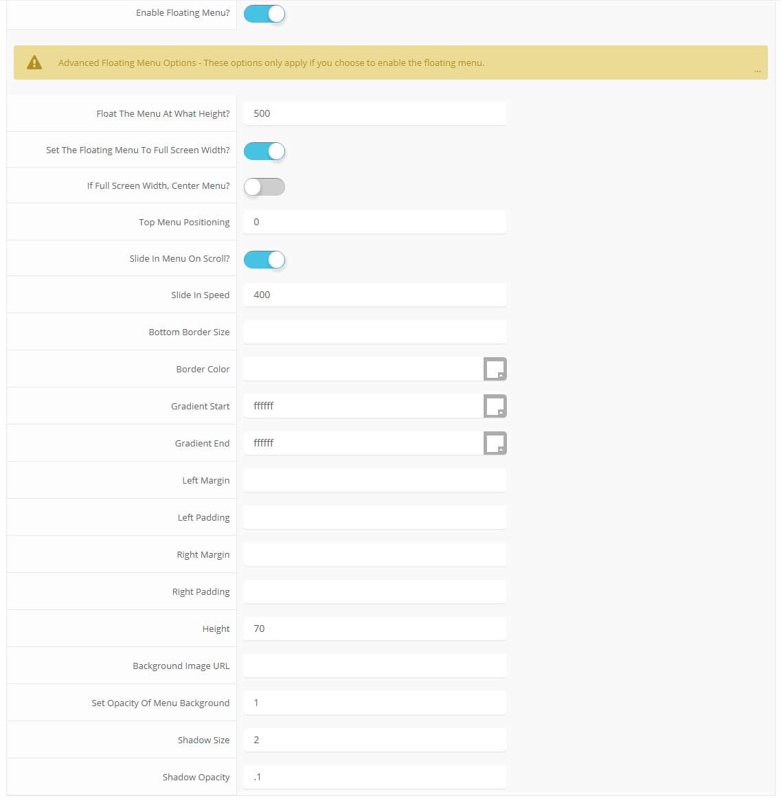
The floating menu feature is a great way for your users to easily navigate your website! The floating menu will show at the top of your browser once the screen reaches a certain point. You can determine the exact point at which this occurs via the template specific area of Vertex. NOTE: This is a Vertex addition and is not guaranteed to work with all Vertex Templates. Some custom CSS may need to be adjusted per template. This feature is not supported by IE7/8.

Features at a glance:
- Set a background image to the menu, gradient or solid color
- Set to snap or smooth scroll in
- Determine at which point as you scroll down your page that the menu drops in
- and many more features, just check out the screenshot below
Admin area of the floating menu:
